How I Design for Emotion, Not Just Aesthetics: Lessons from 7 Nepali Brands
The Invisible Side of Design
When people think of design, they usually think of color palettes, fonts, or buttons that “pop.” But for me, design isn’t about decoration, it’s about emotion.
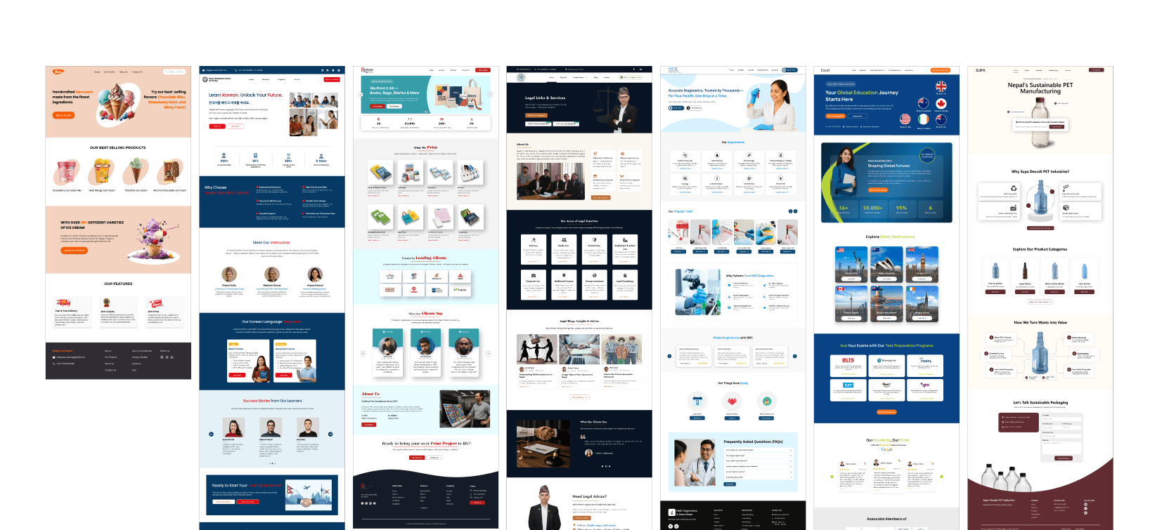
Over the years at AntlrByte, I’ve had the privilege to design digital identities for a range of Nepali brands, from educational institutions like Excel Education and NMC to manufacturers like Supa Deurali PET Industries and publishers like Release Publication Udhyog. Each project taught me one thing:
Good design doesn’t just look good — it feels right.
The moment someone lands on a website, they subconsciously feel something. That “feeling” becomes the brand’s voice before any text is even read.
Step 1: Understanding Emotion Before Interface
Before opening Figma, I spend time asking emotional questions — not technical ones.
What emotion should the website evoke?
How do we want users to feel while browsing — inspired, assured, or confident?
What visuals, tone, and motion can express that emotion truthfully?
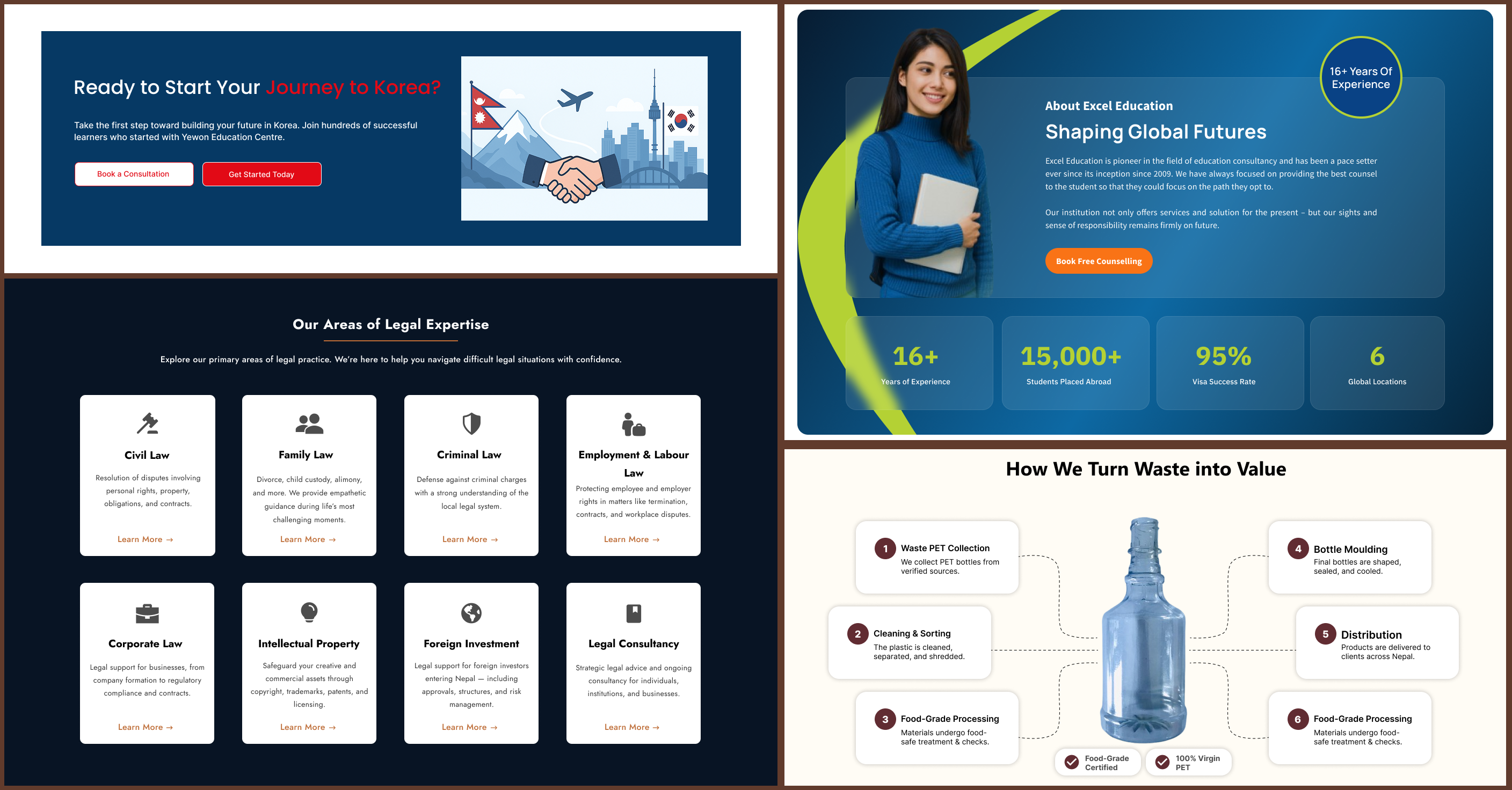
When designing Yewon Education, the goal was to create a digital experience that motivates and empowers. The tone had to feel bright, youthful, and encouraging, echoing the dreams of students planning their next academic journey abroad.
The color palette reflected optimism, light blues and fresh tones, while the open layouts encouraged a sense of clarity and ambition.
In contrast, Release Publication Udhyog required a completely different energy: heritage and craftsmanship. The design leaned into earthy tones, serif typography, and structured grids, evoking the tactile feel of printed pages in a digital space.
For Legal Consultancy, the emotion was trust, the foundation of any legal relationship. Clean layouts, confident typography, and a refined palette of blues and whites helped communicate professionalism and reliability.
Each of these projects started with the same question: How should people feel when they interact with this brand?
That answer shapes everything that follows layout, color, hierarchy, and even the smallest hover animation.

Step 2: Translating Feelings into Design Systems
Emotion is intangible but your layout, color, and typography make it tangible.
While working on Excel Education, for instance, the interface had to feel personal and actionable. Buttons were designed to feel intuitive, copy was conversational, and imagery showcased success and trust, helping students feel guided, not sold to.
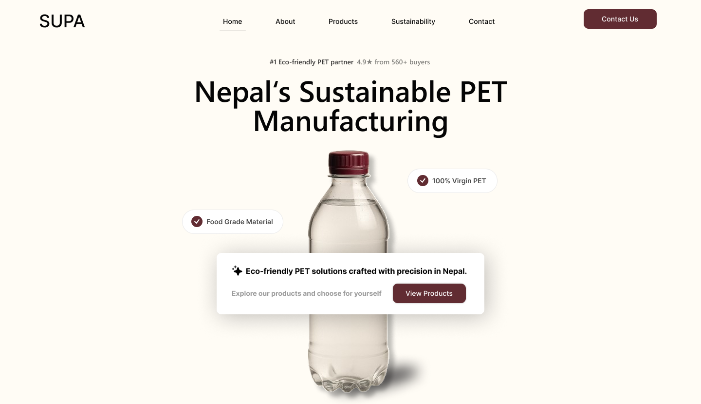
Similarly, Supa Deurali PET Industries needed to feel industrial yet sustainable. The design used strong geometric visuals and a clean, structured layout paired with soft environmental tones to show both strength and responsibility.
Emotion in design is not about adding color; it’s about crafting an atmosphere.
Step 3: Designing for Trust Through Micro-Interactions
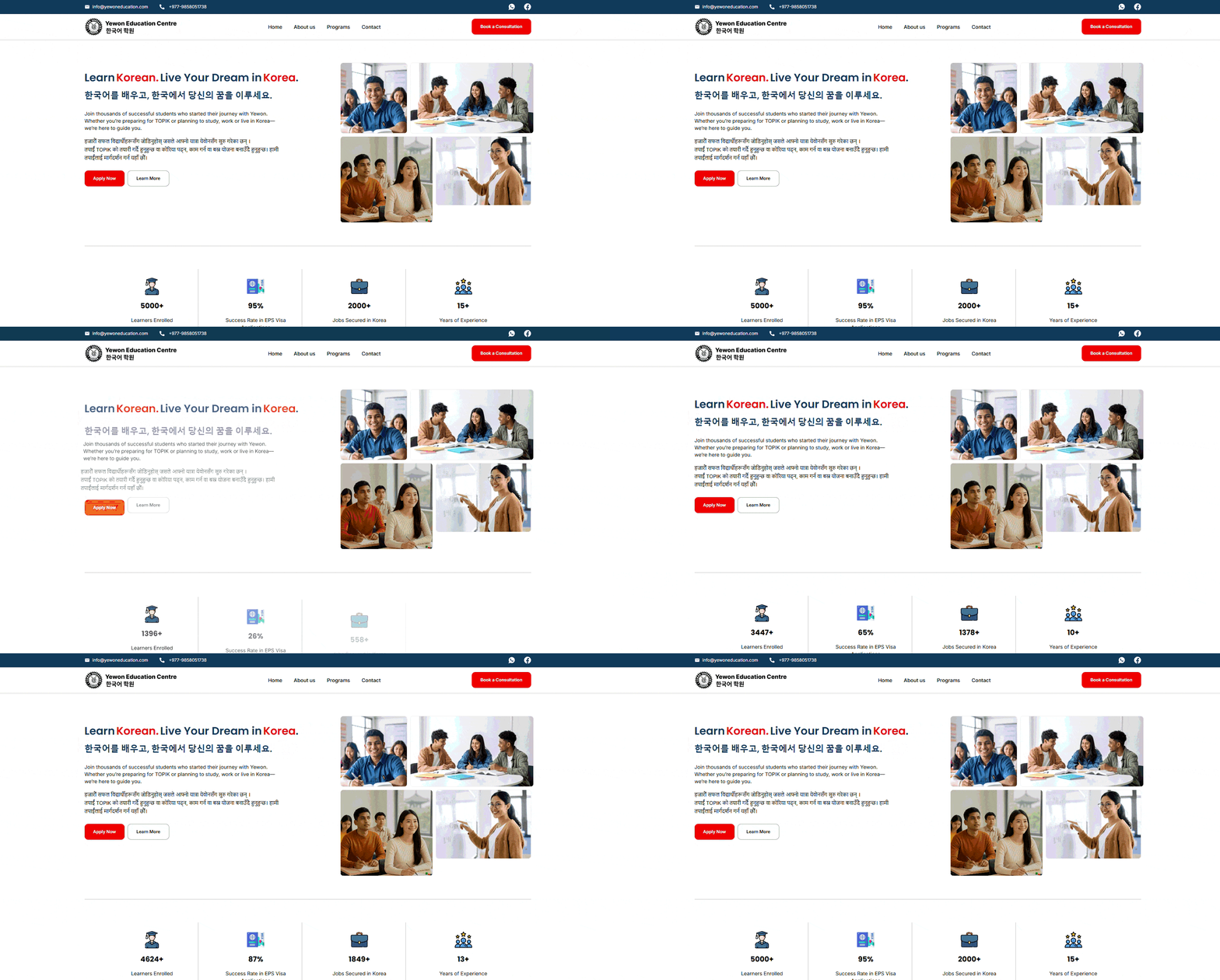
Emotion also lives in the micro-moments such as hover effects, button transitions, and scrolling behaviors.
Take Yewon Education Centre, for example. Subtle animations and movement cues guide users gently through medical services and contact options, creating a sense of clarity and confidence and engagement. Each motion is purposeful, easing navigation while reinforcing the center’s trustworthy and modern identity.
Even in the smallest details like the way a button glows or fades, the users feel cared for or animations that looks visually pleasing. These micro-interactions build subconscious trust and a sense of flow.
The tiniest transitions can make a digital experience feel human.
Step 4: Designing Beyond Screens
Today, design extends far beyond screens. A consistent emotional identity must live across all brand touchpoints.
For Supa Deurali PET Industries, the digital visual language: strong lines, clean structure, and sustainability-driven colors, translated seamlessly into product labels, packaging, and print catalogs.
Every pixel on the site had a physical echo in the brand’s real-world materials.
Consistency builds trust, but emotional alignment builds connection.
Step 5: What I Learned From Designing for Nepal
Working with Nepali brands is a constant exercise in balance between modern appeal and local authenticity.
From education to industry, every project has taught me that design is not about showing creativity, but about understanding emotion.
It’s about translating what a brand stands for into what a user feels.
Because at the end of the day
The best design isn’t noticed; it’s felt.
Closing Thoughts
As a designer, I’ve realized that my job isn’t to decorate screens — it’s to create experiences that move people.
Emotion-driven design transforms brands from “websites you visit” to “stories you remember.”
If each click, scroll, or interaction leaves someone feeling inspired, understood, or confident — that’s when design succeeds.
